Best Homepage Design Examples for Your Startup
- RocketHub Team
- November 9, 2021

A homepage design is one of the essential elements for a startup as it will affect your potential customer’s first impression when they are visiting for the first time. It’s the ultimate deciding factor to continue scrolling and check out your products or exit. Hence, you need to make ample optimizations to make your website as user-friendly and attractive as possible.
It may seem overwhelming right now to incorporate so many elements in your homepage, but we have just the right fit for you! We have accumulated a series of the best homepage examples of some of the top brands that have done a fantastic job of building interactive user homepages designed to drive more conversions. You can use them as a basic reference while creating your home page, but it is always recommended to never copy them entirely and make your homepage more unique. On that note, let’s dive deep into the best homepage design examples for your startup today!
The Importance of a Well-Designed Startup Homepage
Your homepage represents your brand and should convey what your business is about and the type of products you sell. Next, it should resonate with your target audience and communicate a compelling value proposition. Needless to say, it should be optimized for mobile devices since most of your visitors would be scrolling through their smartphone screens to check out your website seamlessly. Your homepage should be well organized with an intuitive design and easy to navigate to make it more user-friendly. Lastly, your website is all about driving conversions and bringing more sales. Thus, your homepage should have multiple CTAs that persuade your visitors to purchase and become your loyal customers.
The Benefits of a Well-Designed Homepage?
A well-designed and interactive home page comes with many benefits. It welcomes potential customers to your website and guides them to the entire procedure until the final checkout. Here’s a list of potential reasons why you should pay more attention to your website’s homepage while building your website.
Help your target audience know about your business
Most of your audience will arrive at your homepage in the beginning. Hence, it is your chance to shine and make your first impression long-lasting. Your homepage portrays your company’s values, unique selling proposition(USP), and purpose. Your visitors will not be willing to stay on your website if they do not know what your company is all about.
Improves the user experience
Your visitors may visit your website to check the product line, read your blog posts, or even get your company’s contact details. You need to ensure that the entire navigation is smooth and takes them to the right page seamlessly. Your homepage could be the ultimate guide that facilitates this transition and the overall website flow.
Bring more conversions
Your website is built to convert more users. Now, if you want to build an email list, you need to allow them to stumble upon the signup form effortlessly. This can prove to bring more conversions since the more people who sign up for your email list, the more your database will grow, which you can later use for your marketing efforts.
Again, if your home page is user-friendly, and your visitor has enjoyed the experience on your website, they are likely to come back again to make the purchase the next time!
Improving brand awareness
As we said, you need to make a long-lasting impression on your visitors. Your website is just the virtual representation of your brand. You need to make it memorable by bringing your brand image right in front and conveying your brand message seamlessly.
Your logo, tagline, and purpose should be the center of attraction on your homepage. It should also be about the problems your business solves for the customers. All of this together can help in making your brand more approachable and result in improved brand awareness.
Best Examples of Well-Designed Homepages
Dropbox
Dropbox is an amazing example of good marketing paired with simplicity. It doesn’t go overboard with its marketing. With two CTAs on the homepage and a row of the services they offer, Dropbox has an attractive homepage. It has also strategically color-coded the CTAs by using a darker background on the CTA, leading to the paid version to draw more attention which is yet again a genius move.
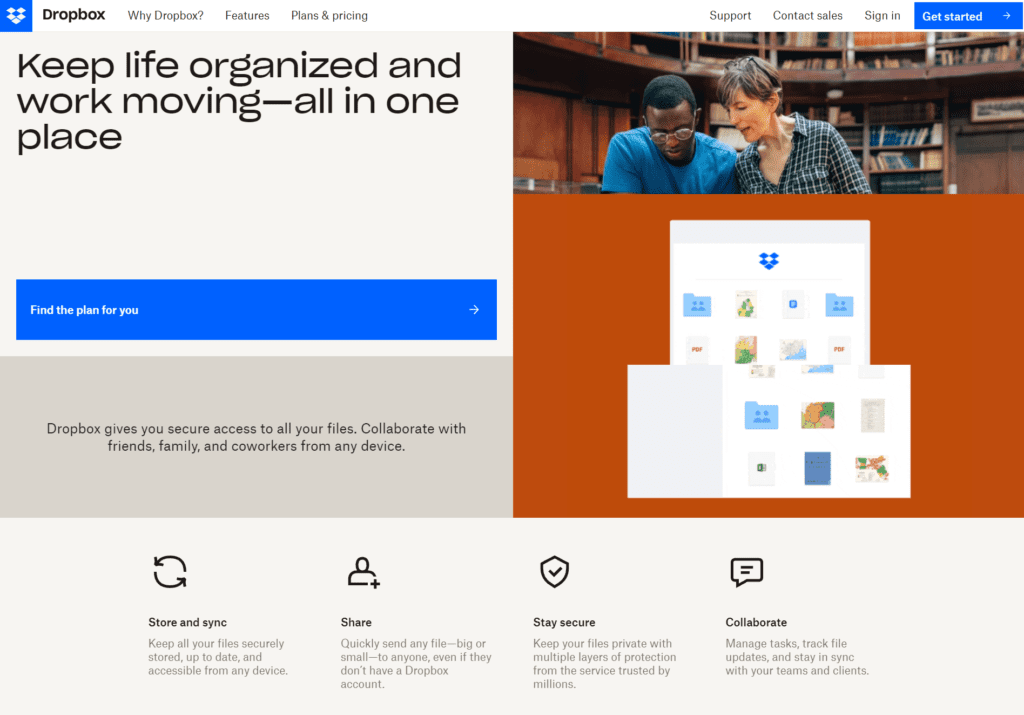
It focuses only on the pain points about the target customers and lists the benefits of using dropbox. Furthermore, the navigation is simple and easy, which results in a user-friendly interface.
Slack
Slack has a homepage that portrays unique illustrations for its visitors. Since visual cues are best perceived by users, Slack has ensured to focus on custom graphics that are minimal yet convey everything about the brand.
The tagline – “Slack is where the future works” is highly creative and can easily capture the attention of their visitors.
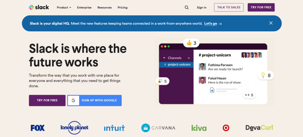
Again, Slack has a very user-friendly interface that is easy to navigate. The CTAs to sign up are placed right above, and the center of the screen guides the visitors to proceed with Slack. It also has a dropdown menu right at the top, which helps visitors find what they need in just a few clicks after entering the website.
Green Mountain Energy
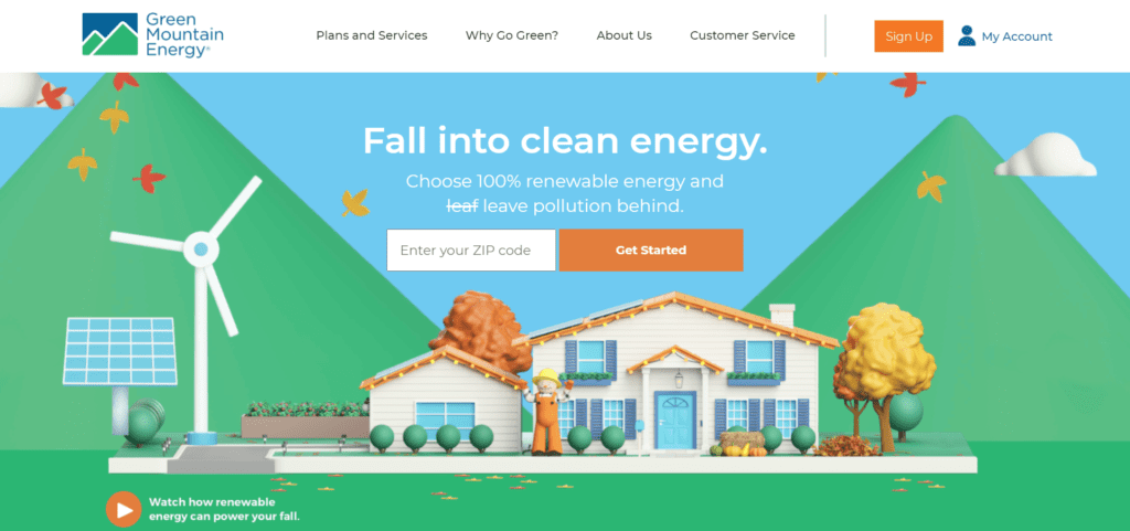
Another incredible example of simple yet interactive custom graphics is the homepage of Green Mountain Energy. The approach of conveying what the brand does and the areas they offer their services is very straightforward, which is a great choice. They also have stated all the options for the users such as customer support, solutions, products right at the top to prevent visitors from juggling between different web pages in search of what they need. Again, the graphics definitely steal the show here.
CarMax
CarMax offers services for buying and selling cars, and the homepage perfectly suits their purpose. Even though they have placed the CTA for finding the right in the middle of the screen, they have also placed the option of selling right at the top of the screen, which offers visitors the flexibility to choose what they need under a single page.
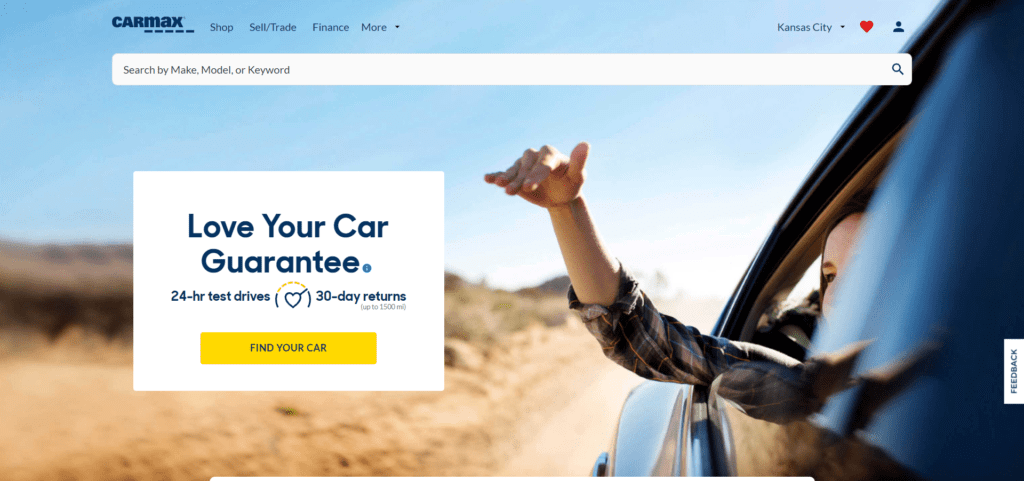
The graphics are simple and neat. They have also mentioned their benefits – 24*7 test drives and 30-day returns which is a great move to maximize the conversions. Such points discussed right in the front of the homepage helps users to make their purchasing decisions quickly and favor the company.
ThredUP
While building a homepage, it can be tough to analyze which one should get the most attention – introducing the business or the flagship product.
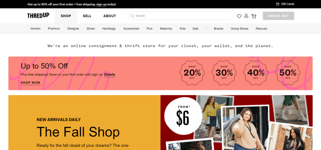
Hence, ThredUP went for the seasonal approach that adds everything in the right balance on the homepage. It starts with the page navigation buttons and introduces the brand along with the discounts and offers running on the website, which can compel visitors to check out their product line. Next, they used certain images with discounts and offers mentioned, which are not even congested yet make a great impression. Next, they have listed out the different categories for their visitors right on the homepage, which again helps in the user navigation for the visitors.
StudioPress
Studiopress has a very straightforward interface. They have simple illustrations, minimal elements, and muted colors, making the home page very simplistic and sophisticated.
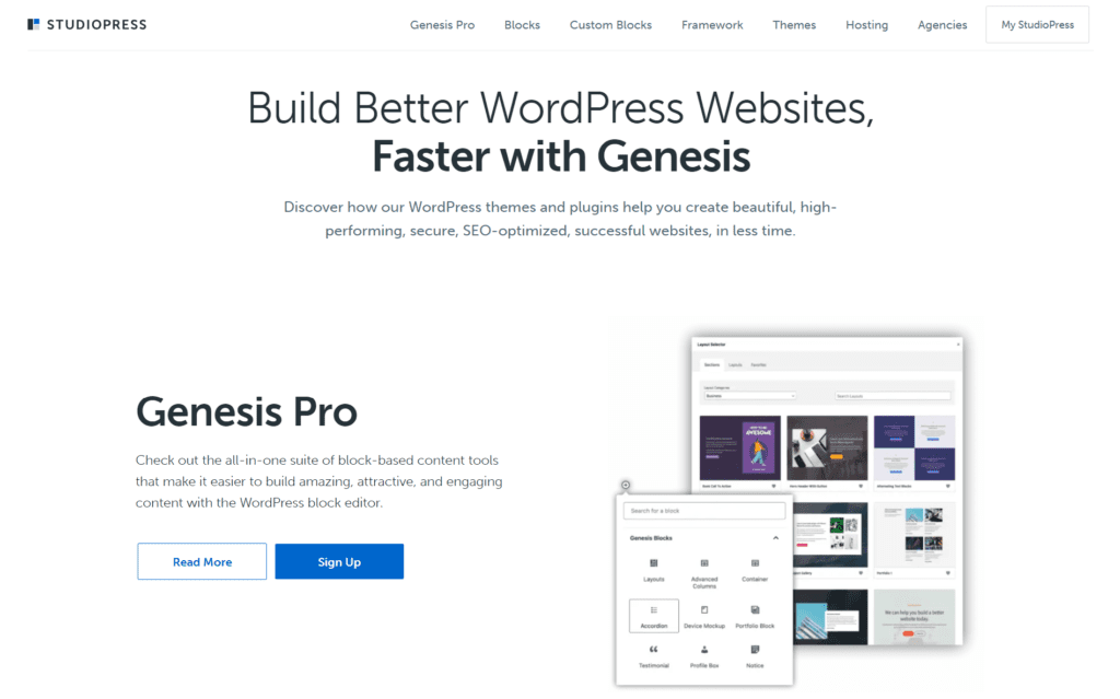
It introduced the brand right at the beginning of the homage and added the CTAs below it, which is a great way to persuade customers to sign up for their services directly.
Healthline
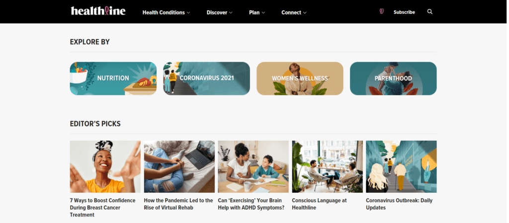
Since Healthline is a completely educational website that provides insights into healthcare, nutrition, diseases, fitness, and more, it has a very user-friendly and simple homepage. Instead of a big headline, it directly jumps to the list of their recent blogs and some categories for the visitors to choose what they want to be educated with. For navigation, they have mentioned the options right at the top of the screen for the visitors.
Crazy Egg
The Crazy Egg website is all about encouraging visitors to add their website URLs to view a heatmap which is again a great CTA for signing up for their services right when they visit the website. They also mention the perks of signing up right below its 30-day free trial and anytime cancellation, which helps build the users’ trust to try out their services.
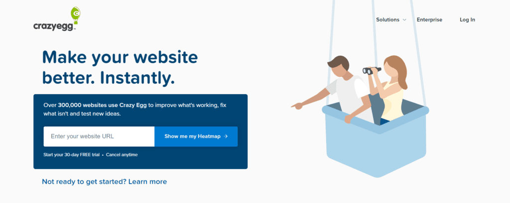
The Learn more option is also a great addition for easier navigation since it mentions how it can help visitors who are not sure whether they should sign up for their services or not. Simple yet effective!
Abacus Plumbing
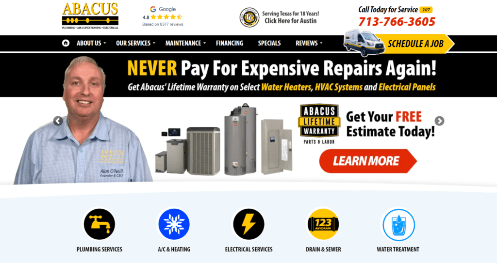
The Abacus Plumbing homepage starts with reviews to build trust in their services. It ends with the list of the services they offer while introducing the visitor to the brand and the current offers running on the website right within a single space. Even though it may look slightly cluttered, it has all the required elements to convert a user within the initial few seconds of visiting the website. Such a homepage is mainly focused on building the trust of the viewers. Hence, it definitely stands for the purpose and the cause.
Trivago
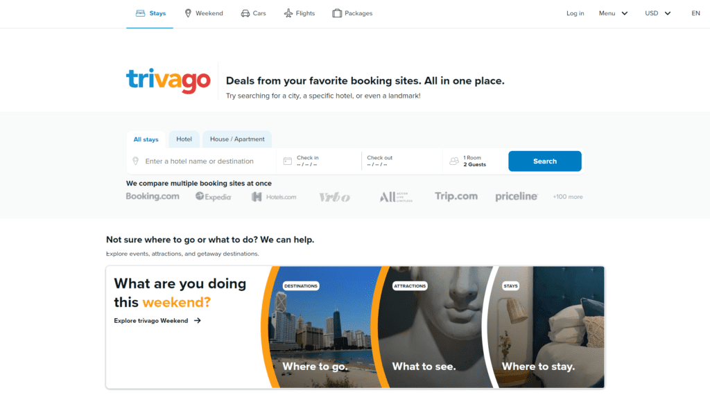
Trivago is another example of minimalism yet effective! It has all the elements such as navigation icons, a CTA to start with their services, a row stating how reliable their services are, along with another solid CTA to compel the visitors to go for a holiday this weekend! They have it all without making the homepage much cluttered!
Century21
The Century 21 homepage is also elementary yet straightforward. The focus here is only to start the search for properties near the location. It has a menu right at the top, which lists the other web pages for easier navigation.
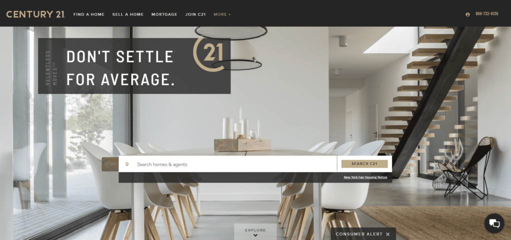
They also have a very simple yet intricate background of an amazing property, which is highly prepossessing to the eyes! In short, the homepage of Century 21 is simple yet captivating!
Marc Jacobs
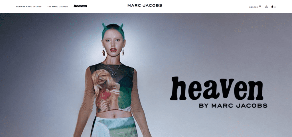
Marc Jacobs has a very minimalistic and sophisticated homepage. There are no such CTAs which can be a drawback. However, for easier navigation, they have listed all the categories right at the top of the screen, which may also look clustered to a few people. They also have their offers mentioned right below it to attract the visitors easily.
Laura Worthington Fonts
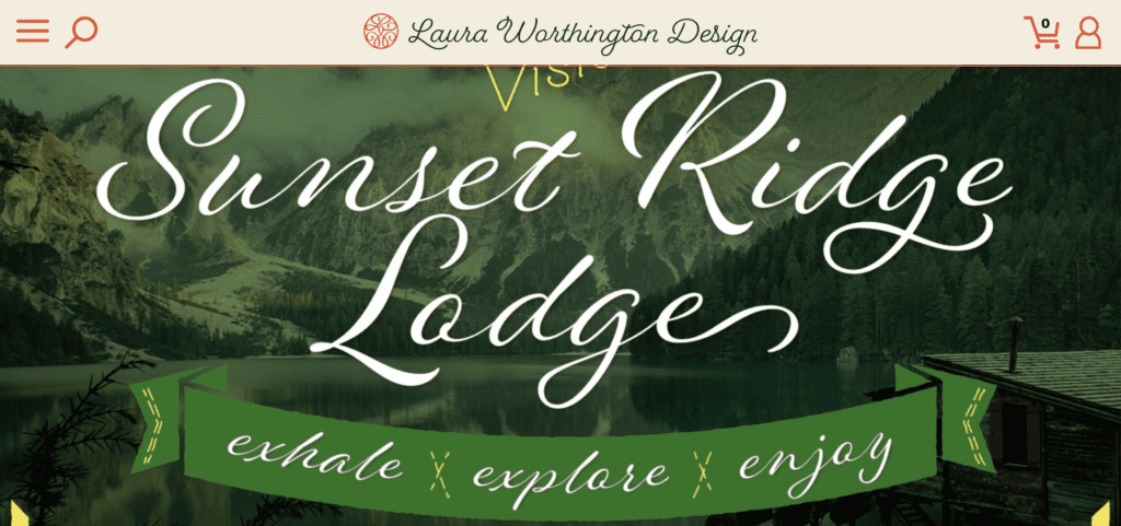
The homepage of Laura Worthington is all about portraying their skills in a flawless calligraphic statement. It is colorful yet muted, which is a good balance for the users. It is not cluttered yet demonstrates their services beautifully!
Skype
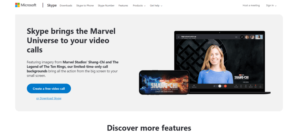
Skype has very seamless navigation with two prominent CTAs placed right at the middle of the screen. The graphic subtly demonstrate their services and the technology they use. They have even distinguished both the CTAs with different backgrounds to compel the visitors to use their services right away!
Fitness Blender
Starting from the logo to the Marketing copy. The homepage of Fitness Blender is seamless and very attractive. They also have a simplistic approach yet achieve adding all the required elements to persuade visitors to sign up for their workout plans without looking cluttered.
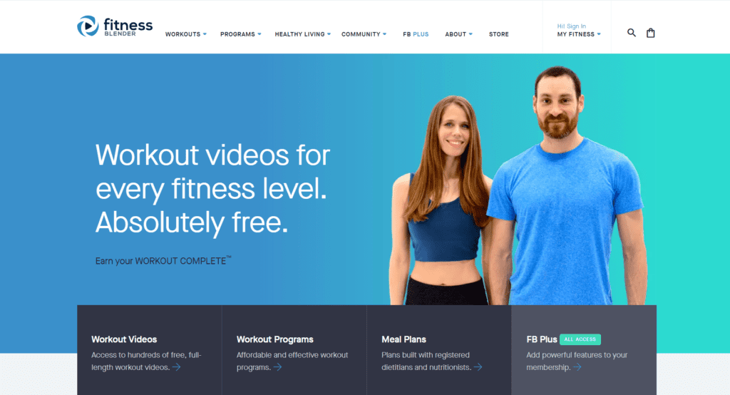
For navigation, they have the list of options to other web pages right at the top of the website and the list of services right below the image of the creators.
Also, let’s not forget, the main attraction is the tagline – “Workout videos for every fitness level. Absolutely free”.
How to Find Out What’s Working and What’s Not on Your Homepage
Homepage designs are highly subjective, and everyone may not perceive a single design in the same way. You can try A/B testing to understand which one brings the best results.
However, all of it comes down to how your visitors respond to your homepage. Hence, you can run different user behavior reports that give insights on the number of clicks, scrolls, and other metrics that demonstrate how visitors react to your design elements. Once you collect all these insights, you can then refine and tweak your designs accordingly.
Conclusion
There is never a specific formula to creating the perfect homepage for your website. It is all about trial and testing different designs to understand which one works the best. The key here is to position all the elements with eye-tracking to make it much more attractive and effective. Focus on a simplistic design that conveys all the required points of your brand, highlighting all the attractions of your brand, some compelling CTAs to convert your viewers into customers, and you can easily transform your regular website into a conversion machine!
Share This Post
RocketHub Team
The launch crew at RocketHub writes about startup and SaaS growth. Be a fellow Rocketeer and show some love by commenting below with your thoughts on our content.
Table of Contents
Get The Latest Updates
Subscribe To Our Weekly Newsletter
Sign up below to be one of the first crew members onboard and get early access to amazing deals.
Recent Posts

Social Media
Categories
Related Posts

Lifetime Deal Platforms
The best lifetime deal platforms for software. Platforms lik RocketHub scour the web for the highest quality products to bring buyers the best lifetime deals on their platform.

How to Work for Yourself + 13 Solo Business Ideas
Do you ever wonder if being your own boss could truly set you free? In this article, we’ll explore the theory that unleashing entrepreneurial freedom
7 Reasons Why Every SaaS Team Needs Interactive Demos
Making a Case for Interactive Demos: 7 Reasons Why Every SaaS Team Needs Them Let me paint a scenario for you. You want to buy

